The analytics allow you to track listener engagement, identify areas for improvement, and evaluate how effectively the avatar responded.
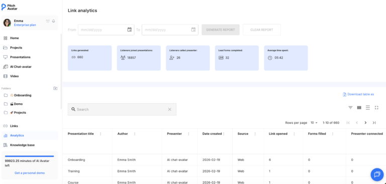
Click the Analytics tab at the bottom of the left sidebar.
You’ll see a full list of your presentation links, along with other presentation details.
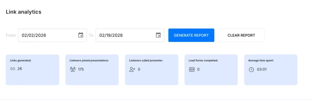
Generate report
Need insights for a specific timeframe? Simply set your desired date range in the provided fields and click the Generate report button. You’ll get a detailed overview of your presentation analytics for that period.
Each link to a presentation can be analyzed based on the following parameters, including:
How many times the link has been opened
The number of filled lead forms
How many times the listener joined the presentation, communicated, or called the presenter
The number of slides viewed by the listener
The average viewing time of the presentation via the link
The date and time when the link was last opened
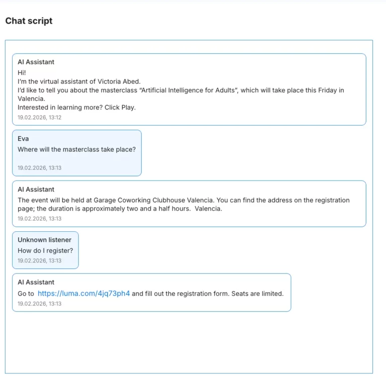
Record of the avatar’s replies during chat with the listener
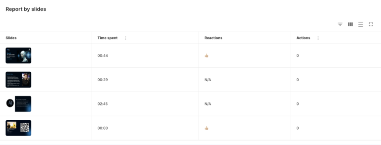
Report by slides
Select a specific presentation or link to view detailed analytics, gaining in-depth insights into listener behavior and engagement.
Record of the avatar's replies during chat with the listener