Hey presenters, it’s 2025! What does that mean? People won’t put up with slides that look straight from the 90s. But how can you make your presentation look stylish, readable, and engaging while also ensuring that the information you are trying to deliver doesn’t get lost in a clutter of colors and fonts? Follow the advice in this article to create picture-perfect slides to win your audience’s attention.
Consider the "night" background
Not so long ago, in 2019, remote work was reserved for a relatively small number of full-time employees – no more than 10%. According to the ILO, 8% of the world’s employees were working remotely. However, by the end of 2022, this had changed dramatically. Now, 25% of the world’s full-time employees work remotely, and a similar percentage of people work in a hybrid model. More than 50% of leaders have said that employees will work from the office part of the week and remotely for the rest.
What does this mean for a presenter? Firstly, their audience is spending much more time in front of screens, leading to increased strain on their eyesight. If your presentation is designed for an audience that spends a lot of time in front of a computer, using a dark, eye-sparing background would be a logical step. Additionally, night mode highlights the text, making it easier to read.
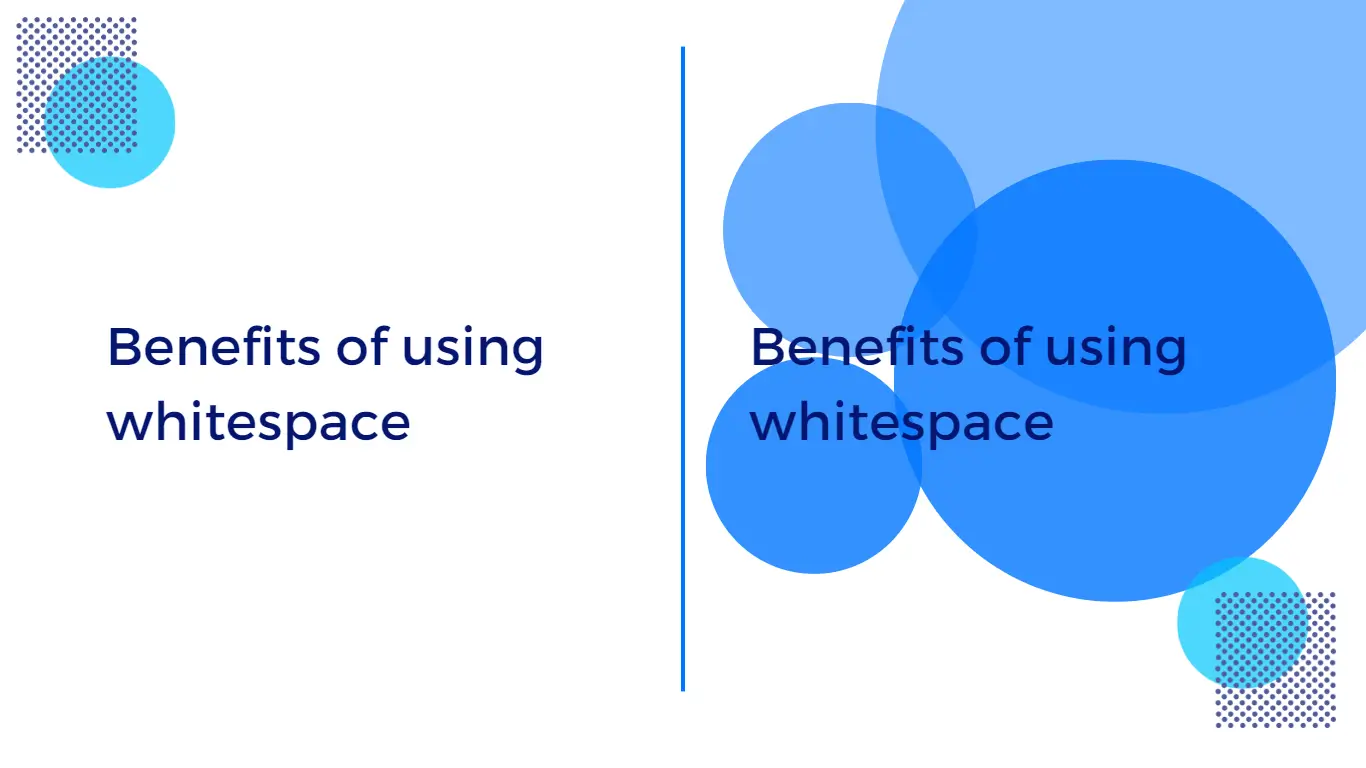
Use white space: don't be afraid to leave space around your text and images
Using white space effectively is a crucial aspect of designing effective sales and marketing presentation slides. It can create a sense of balance, simplicity, and clarity on your slide, allowing your audience to focus on the most important information.
A slide that is too cluttered or busy can be overwhelming and confusing. By leaving space around your text and images, you can create a more visually appealing and easy-to-read slide. Effective use of white space can also help key elements stand out more, making them easier to notice and remember.
If you are not confident how to work with the space, consider using a grid system to help you create a layout that makes the best use of it.
Bold typography can add visual interest to your slides and help emphasize key points
People don’t like text on the slides. The study by Nielsen Norman Group, eye-tracking research, found that people tend to skip over large blocks of text on slides, focusing instead on images and other visual elements. So, apart from trying to keep your slide not cluttered with it, you can also try to embed it as a part of the design.
Bold typography can help key information stand out and make it easier for your audience to read and remember. When using bold typography, it’s important to use it sparingly and strategically. Use it for headlines, subheadings, or to highlight specific words or phrases that you want your audience to focus on.
Choose a font that is clear and easy to read, even in bold. Experiment with different font sizes and weights to find the right balance for your presentation. Using bold typography can help make your presentation more visually interesting and engaging, while also making it easier for your audience to understand and retain the information presented.
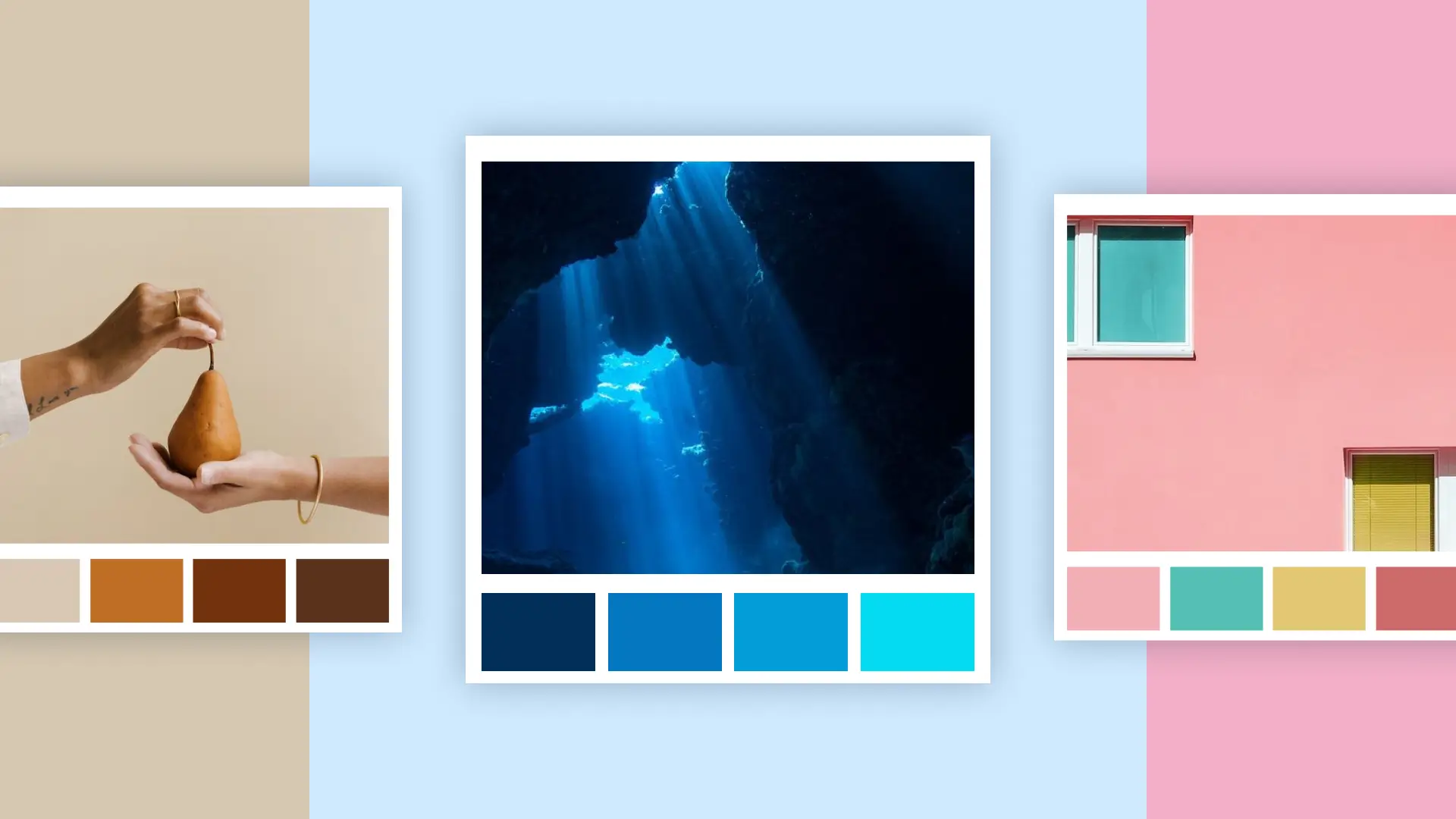
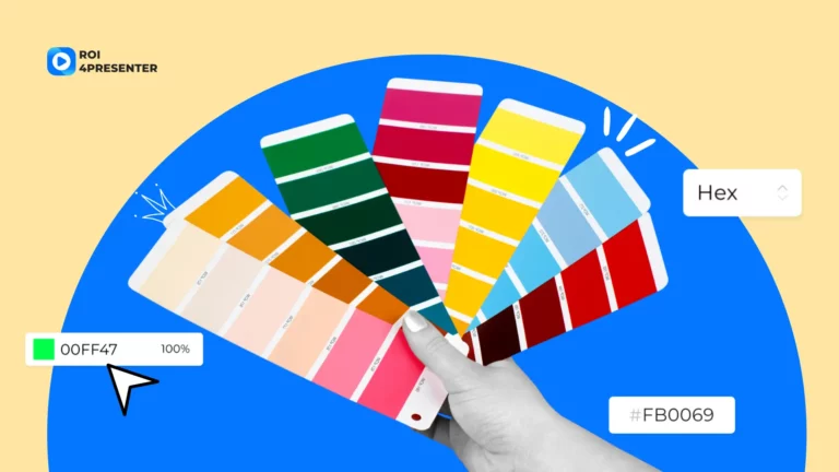
Conquer the audience with subtle tones
As in previous years, neutral, muted combinations of close colors and shades will remain popular. Suppose you create a presentation for a thoughtful audience, assuming that your audience will quietly ponder and analyze the information. In that case, your choice is something like “depth – ocean,” “caramel – cream,” “skin – parchment,” “azure – ice,” and so on. It’s intuitively clear what we mean; the main thing is that the resulting combination should be smooth and exciting.
Use a consistent layout
It means that all of your slides should have a similar structure, including the same fonts, color schemes, and backgrounds. This approach helps your audience stay focused on the content of the presentation rather than being distracted by different designs on each slide.
A consistent layout can save you time and effort. Instead of creating a new design for each slide, you can use a template that you’ve created and simply change the content. This makes it easier to create professional-looking slides quickly, without sacrificing quality.
Finally, a consistent layout can help you build brand recognition: you’re building the image of your brand that your audience will come to recognize and associate with your company.
But nothing engages people more than personal attention, so put your amazing slides into Pitch Avatar to speak to your audience right at the moment when they are viewing them!
Anna Sannikova is the Chief Marketing Officer at Pitch Avatar, leading the company's marketing strategies. With a passion for creative content and digital solutions, she drives brand growth and engagement across global markets.