Let’s talk about what not to do if you don’t want your event to end in an epic fail.
Every time a prospect leaves your demo within the first two minutes, or a new hire gets distracted during onboarding, or a sales deck lands in someone’s inbox and never gets opened – there’s usually a fixable online presentation mistake behind it. Here are the most common ones B2B teams make, and exactly how to correct them.
Online presentation mistakes are costing teams more than they realize – lost prospects, disengaged learners, and demos that never convert. The post-pandemic shift to hybrid work created an overdose of webinars, webcasts, and online meetings, and without a training manual or role models for what good virtual presentations actually look like, most professionals are improvising. Attendees now commonly multitask, nodding politely and checking emails – this is tiring for both organizers and audiences.
Before we get into the specific mistakes, it’s worth understanding where they come from. Based on the collective experience gathered within the Pitch Avatar team, these mistakes have three main sources.
Why Online Presentation Mistakes Happen

Fear of public speaking. 75% of people suffer from glossophobia to some degree – this is the term for the fear associated with public speaking. If we include not only fear, but also excitement and anxiety, the percentage of those affected by public speaking to some degree will be even higher – about 90%. Fear is known to be a bad counselor and often compels us to make wrong, irrational decisions.
Lack of time and other resources
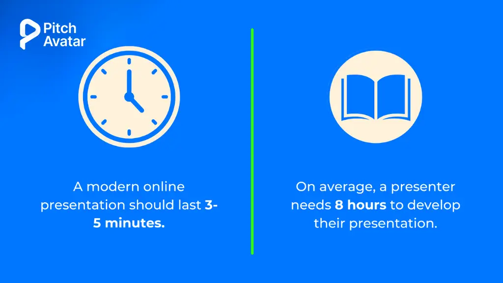
Lack of time and other resources. Correctly determining the type and amount of resources that you will need in order to prepare a quality online presentation is half of a presentation’s success. The most valuable resource is time. You must have enough of it to prepare a creative and original script, bring it to life, and leave time for rehearsals. A lack of time can result in interesting speakers declining invitations to participate, as well as limiting the number of qualified specialists who will attend and perhaps even prevent the purchase of necessary tools. Haste, inevitably arising due to a lack of time, will inevitably lead to mistakes and suboptimal decisions. The only question is their criticality and quantity.
Relying on the same deck for every audience and every use case. About 75% of presenters reuse the same template repeatedly – and it shows. The solution isn’t more creativity, but more focus. Before opening PowerPoint, define the audience, the desired action, and the one message you need them to remember. Then build the deck around that – not around the template you used last quarter.
The Most Common Online Presentation Mistakes And How to Fix Them
Mistake 1: Ignoring Your Technical Setup Before Going Live
If your audio cuts out or your camera angle shows only your ceiling, no amount of great content will save the session and in a B2B context, that’s a prospect you may never get back.
Technical failures are among the most common and most damaging virtual presentation mistakes. Camera not at eye level, poor microphone quality, a distracting background, and a lack of platform testing before going live are all preventable problems that immediately undermine trust.
How to fix it:
- Position your camera at eye level – not below your chin and not above your head.
- Use a separate microphone rather than your laptop’s built-in audio jack.
- Point the light directly at your face; avoid sitting with a window behind you.
- Remove background distractions or use a clean, neutral virtual background.
- Conduct a full rehearsal with a colleague at least 24 hours before the session – not only to practice the content, but also to test screen sharing, audio, and any polling tools or interactive features you plan to use.
- Have a Plan B: send your slides to a colleague in advance, keep a PDF backup, and have questions ready to fill time if technology fails.
Mistake 2: Creating Your Virtual Presentation Based on an Offline One
This was perhaps the most common mistake made by online event creators when virtual presentations first became widespread. They simply conducted online presentations and webinars as if they were working in front of an audience in a conference room.
The laws of nature differ between online and offline events. Winning the attention of an online audience is much more difficult than winning the attention of the same audience sitting in a classroom or conference room. Overall, an audience in an auditorium is captivated by the spectators, and it is much easier to hold their attention. Where else could they look if not at you and the slides projected on the screen? Even if an audience in an auditorium is not very interested in what is happening on stage, they will not move to another auditorium. There is also a psychological element — most people would not dare to get up and leave in the middle of a presentation. That is why the presenter of an offline presentation can afford to spend 20 or 30 minutes of the audience’s time.
An online audience is a different matter. Switching to another screen or even another device takes just seconds. And there are no psychological brakes being applied, since no one sees you. When meetings went virtual, it happened quickly and without guidance — no action plan for people with divided attention spans, and no examples of what engaging virtual presentations actually look like. 10 minutes is a practical limit, beyond which the majority of your audience’s attention in an online event drops to zero. The average viewing time of a modern online presentation is 3–5 minutes.
How to fix it:
- In a virtual presentation, you need to boil everything down to the main idea – eliminating anything that doesn’t help the viewer make a decision or absorb the information.
- Include interactive elements every 5-6 minutes: a question, poll, chat request, or pause for discussion and response.
- Design that fits the format: shorter, clearer, and more engaging than for an online event.
Mistake 3: Wasting the First 15 Seconds on Yourself
Online presentation viewers decide very quickly whether they like what they see and whether they will continue watching. This takes approximately 15 seconds. A presenter who succeeds in getting the viewer to watch the first 2–3 slides can expect the viewer to watch the presentation to the end.
Many presenters waste this window on lengthy introductions that include a long story about themselves, the history of their company, and uninformative introductory slides. It is quite possible that all of this will be followed by content that would really interest the audience. But they won’t see it, because by that time, they will have already dispersed.
How to fix it:
- Start with something that immediately establishes value: a surprising statistic, a clearly stated problem, a provocative question, or a short story that poses a key question to the viewer.
- Cut the company history slide, the lengthy self-introduction, and the agenda overview from your opening – these can come later, or not at all.
- Start with interesting information right away and try to present it in an engaging and attention-grabbing way.
Mistake 4: Using the Same Presentation for Every Audience
A presentation built for executives shouldn’t look or sound like a team training deck. Yet many presentations fail because they assume that one message will suit every audience.
Successful presenters adapt their content based on who it is intended for. Tone, depth, visuals, and calls to action should shift depending on whether you’re pitching, reporting, or educating. A CFO cares about ROI and risk; a VP of Sales cares about pipeline and rep efficiency; a new hire cares about clarity and confidence. Using different templates and structures for different audiences helps ensure your message resonates and achieves the desired results.
How to fix it:
- Before creating any presentation, define: Who is this for? What do they care about? What action do I want them to take?
- Adjust your level of detail, examples, and structure to match the audience’s context and expertise.
- Create separate versions of key presentations for different audience types, rather than trying to make one presentation suitable for everyone.
Mistake 5: Turning Your Presentation Into a One-Way Broadcast
Without a doubt, the best way to achieve success with a virtual presentation is to engage your audience throughout the entire presentation. The more they’re actually interacting with the content, the more effective the presentation will be.
One of the biggest mistakes you can make online is to talk continually to the audience instead of with them. While people are sitting in a meeting room, social pressure will prevent them from much more than sneaking a furtive glance at their mobile. At home, there’s no one to stop the enticing call of the laptop and its treasure trove of emails, social media, and breaking news.
How to fix it:
- Add interactive elements every 5-6 minutes: questions, polls, chat prompts, or webcam requests for comments.
- Change your approach – design your presentation with interactive components in mind first, then add content based on those elements.
- For longer presentations, take turns speaking with a colleague so the audience hears different voices.
- Use polls, Q&A, and live chat to provide participants with an easy and convenient way to participate.
Pitch Avatar’s conversational AI Chat-Avatar lets viewers ask questions and get instant answers – turning passive slides into a two-way conversation, even when you’re not live.
Mistake 6: Delivering Your Presentation in a Monotone Voice
A flat, monotonous voice quickly loses an audience’s interest. Without vocal variety, even the most insightful content can get lost. This is especially true in virtual environments, where body language cues are less pronounced and your speech carries most of the communication load. Nervousness often leads to fast speech, making it difficult for the audience to follow you. Conversely, speaking too slowly can be just as uninteresting. Tempo matters as much as pitch.
How to fix it:
- Vary your pitch, speed, and timbre to emphasize key points.
- Use strategic pauses to give ideas a chance to “sink” – silence is not dead silence, it is emphasis.
- Record yourself practicing and listen back; most presenters are surprised by how monotonous their speech sounds.
- Ask a colleague to listen to the rehearsal and give honest feedback on the tempo and energy.
Mistake 7: Standing or Walking Around Unnecessarily
When a presenter works from a stage, it is quite clear that they stand and even walk around. Otherwise, the audience sitting in the back seats will not be able to see the presenter well. But why stand or walk around in front of an online audience?
If you’re giving an online presentation standing up, it should be worth it. For example, if you are drawing something on a whiteboard or conducting some kind of virtual tour of a place or object. Unless there’s a compelling reason, the best solution is to be on equal terms with the audience – which means sitting down.
That said, body language still matters in a virtual setting. Nonverbal cues – posture, gestures, and facial expressions – convey a message. Incorrect or inconsistent posture and gestures weaken trust and reduce the effectiveness of influence. Stand up straight when it’s appropriate, demonstrate confidence with open and purposeful movements, and be aware of what your hands are doing.
How to fix it:
- Sit down unless you have a specific reason to get up.
- Maintain good posture whether you’re sitting or standing.
- Use gestures that are visible within the camera frame – not sweeping hand movements that extend beyond the screen.
- Maintain eye contact with the camera, not the screen.

Mistake 8: Letting Your Presentation Become a Performance About You
The biggest mistake B2B presenters make when trying to “engage the audience” is focusing on their own delivery style rather than on what the audience needs to hear, decide, or do next. The goal of your presentation is to motivate your audience to take action – not to showcase your charisma.
This also applies to the temptation to copy famous speakers. Instead of developing their own unique style by adapting some techniques from famous speakers, many presenters choose the manner of, say, Steve Jobs and try to imitate it exactly. The result is usually a bad parody. The benefit obtained by a presentation given in this style is, at best, zero.
How to fix it:
- Start every presentation with the audience’s problem, not your credentials.
- Structure your content around what the viewer needs to know, believe, or do – not around what you want to say.
- Borrow techniques from speakers you admire, but adapt them to your own style and context rather than copying them wholesale.
Mistake 9: Reading From a Sheet of Paper
Paper cheat sheets, while perfectly appropriate on a stage or podium, look odd when used during an online presentation. Obviously, you need some hints. Keeping the key points of an online presentation in front of your eyes is the right move to conveniently keep your presentation on track. But why use paper for this purpose?
Presenting with cards in your hands will make you look ridiculous, like a character in a comedy – movie directors like to play up this situation. Place all your cues on the screen and use them as you see fit, without distracting your audience with the archaic paper usage.
How to fix it:
- Use speaker notes in your presentation software, visible only to you.
- Practice enough that you’re speaking to the key points rather than reading a script.
- If you need to reference notes, learn to do it without breaking eye contact for extended periods.
Mistake 10: Overloading Your Presentation With Small Details
In our opinion, this is a trap that most presenters fall into. They think that the more details they have about every nuance of their product, the higher the likelihood of it being purchased. In fact, a long and detailed description of the functions of each button is very tedious for the audience. And most importantly, drowning in an abundance of details, the audience can no longer distinguish the main idea that you wanted to convey to them from the secondary points.
Remember — the purpose of a presentation is to get potential customers interested in your product, goods, or solution, not to provide instructions on how to use it.
How to fix it:
- Limit yourself to three to five key takeaway points per presentation.
- Move supporting materials into slide attachments, follow-up emails, or links to other resources.
- Ask yourself before each slide: “Does my audience really need to know this to take the action I want?”
Mistake 11: Creating Text-Heavy Slides
Text-heavy slides are the real scourge of online presentations. Many authors cannot decide what the main message is, which leads to slides cluttered with information rather than focused, easily digestible content. The main problem isn’t just that audiences don’t like text-heavy slides – too much content obscures the very point you’re trying to make.
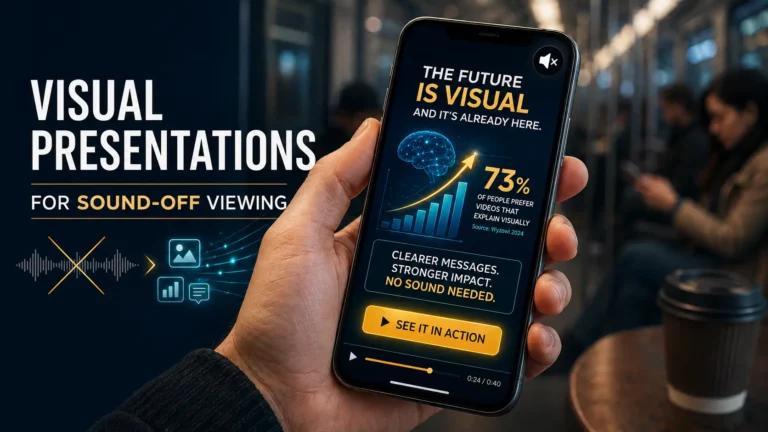
Your slides should contain pictures. A maximum of six words can be on one slide, taking up no more than a quarter of the slide’s area. Another great solution is video slides. Keep in mind that visual information is absorbed faster than text, and the presence of video in a presentation significantly increases the likelihood of conversion.
How to fix it:
- As a starting limit, apply the 5-5-5 rule: no more than 5 words per line, 5 lines per slide, and 5 text-heavy slides in a presentation.
- Replace bullet-point lists with images, diagrams, or short video clips wherever possible.
- If the information is too complex to present visually, consider whether it’s worth including in the presentation at all – or whether it’s better to prepare it in a separate document.
Mistake 12: Ending Without a Clear Next Step
The worst way to end a presentation is to leave people wondering, “What’s next?”. A presentation without a clear plan for next steps is a missed opportunity to inspire action or nudge toward decision-making. For Pitch Avatar’s audience (sales managers, demand gen leads, SDRs), this is directly tied to sales funnel results. A presentation that ends without a call to action is a conversion failure, not just a communication failure.
How to fix it:
- End with a single, specific call to action: book a demo, download a resource, schedule a call, or approve a proposal.
- Make the CTA visible on the final slide and in any follow-up communication.
- Remove any ambiguity about what you want the viewer to do next.
Pitch Avatar lets you embed lead capture forms, meeting schedulers, and “Call Presenter” buttons directly into the presentation – so the CTA is built in, not bolted on.
Mistake 13: Failure to Adapt Your Technical Configuration to an Asynchronous Format
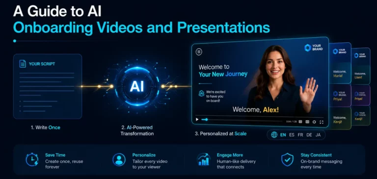
Presenters have bad days – a cold, a stressful morning, a distracted afternoon. And when this happens, it immediately catches the eye. One of the practical benefits of using AI to deliver presentations is that your avatar performs consistently regardless of what’s happening on your end.
For live presentations, the solution is simple: reschedule if you’re not at your best. For scalable, repeatable delivery, consider which format is best for the specific occasion: a pre-recorded format or an AI-generated format.
Unlike human presenters, AI avatars deliver scripts flawlessly with no errors or verbal stumbles, maintaining perfectly appropriate emotions and tone matched to content. This eliminates the inevitable mistakes and slip-ups associated with human presenters in traditional video recording. Organizations implementing this technology have witnessed dramatic improvements in lead generation and user engagement.
How to fix it:
- For recurring presentations (onboarding, product demos, training modules) – evaluate whether a pre-recorded or AI-delivered format would produce more consistent results than live delivery.
- If you do plan to perform live, it’s better to reschedule the show for another time than to continue it when you’re really not at your best.
Mistake 14: Ignoring the Rules About Advice Itself
We left this point for last, because we consider it one of the most important, not only in the art of presentation, but also in life in general. Regardless of who gave them or what recommendations they gave, never turn a piece of advice into a piece of legislation. This is true even when speaking of our advice. Each situation is unique and requires a specific approach. If experience and/or intuition tells you that you need to act contrary to what is generally accepted – do what you think is right. After all, one of the most important purposes of any rule is to stimulate curiosity and the desire to break it.
Bonus: Mistakes Specific to Pre-Recorded and Asynchronous Presentations
Many materials on this topic involve conducting a virtual presentation in real time. None addresses the growing use of asynchronous, pre-recorded, or AI-delivered presentations – which is exactly where B2B sales teams, L&D departments, and customer success teams are increasingly operating.
Pre-recorded presentations fail in different ways than live ones. There is no way to correct a mistake in real time, no questions and answers, and no strength to support the interlocutor in a difficult moment. The specific mistakes to avoid:
No scripting or pacing rules. In a live presentation, you can adjust based on audience reaction. In a pre-recorded format, you have one attempt. Write a concise script, time it precisely, and record multiple takes.
Assuming the viewer will stay. Without a live presenter to hold your attention, every slide must make you want to click on the next one. Add visual variety, focus each slide on one idea, and use interactive elements to engage viewers, not just watch.
No follow-up mechanism. A pre-recorded presentation that ends without a way for the viewer to take action or ask a question is a dead end. Add a call to action, scheduling link, or chat option so viewers can continue watching without waiting for a human to respond.
Inconsistency in different records. If different team members record versions of the same presentation, the quality and messaging will vary. AI Avatars solves this by enabling the creation of consistent, on-brand presentations at scale – regardless of who originally created the content.
Quick Reference: The Most Common Online Presentation Mistakes
| # | Mistake | The Key Fix |
|---|---|---|
| 1 | Ignoring your technical setup | Test everything; have a Plan B |
| 2 | Modeling virtual presentations on offline ones | Shorter, more visual, more interactive |
| 3 | Wasting the first 15 seconds on yourself | Lead with the audience's problem |
| 4 | Using the same presentation for every audience | Tailor your tone, depth, and CTA based on your audience type. |
| 5 | One-way broadcast, no engagement | Include interaction every 5�6 minutes |
| 6 | Monotone delivery | Vary pitch, tempo and timbre; use pauses |
| 7 | Standing or walking without reason | Sit down; maintain a confident posture |
| 8 | Making it a performance about you | Focus on the audience's decision, not your charisma |
| 9 | Reading from a paper | Use on-screen notes; practice to key points |
| 10 | Overloading with details | Three to five key points maximum |
| 11 | Text-heavy slides | Images, video, and the 5-5-5 rule |
| 12 | No clear next step | One specific CTA, built into the presentation |
| 13 | Ignoring asynchronous format requirements | Script tightly; use AI for consistent delivery |
| 14 | Treating any advice as absolute law | Apply judgment; every situation is unique |
The good news: most of these mistakes are fixable – and some of them can be eliminated completely. If your team is running demos, training sessions, or sales pitches at scale, Pitch Avatar lets you deliver interactive, AI-powered presentations that engage your audience, capture leads, and give you per-slide analytics on exactly where viewers drop off. →Start for free