Let’s talk about how to enhance the effectiveness of online content using color combinations.
Let’s start with a small survey. How much time do you spend deciding on a color scheme for an online presentation? Experience suggests that most people don’t fuss too much about this. Perhaps because the first version of the famous PowerPoint was black and white? Just kidding. We think it’s not an exaggeration to say that, compared to writing texts, editing slides, or creating videos, choosing primary and secondary colors takes up very little time in a presenter’s work. Especially if they have corporate colors at their disposal.
Now is the time to remember that we process visual information at a tremendous speed. Approximately 60,000 times faster than text, numbers, graphs with statistical indicators, and the like. Let’s ask ourselves, what role do colors play in this process? To find the answer to this question, you don’t need to delve into serious scientific work. It’s enough to have your own experience and common sense to understand a simple thing – color is one of the most important carriers of information. Moreover, we perceive this information at the level of pure instincts, developed over many millennia of evolution. Color warned our ancestors about danger, allowed them to assess the ripeness of fruits and berries, helped to focus attention on unusual objects and phenomena, allowed to roughly determine the temperature by eye, and even diagnose health conditions. However, why are we talking about ancestors? Don’t colors speak to us today in the same universal language as they did to the Cro-Magnons forty thousand years ago? Remember the words we often use to describe color or color scheme. Gloomy, warm, cold, aggressive, soothing… When we say “warm color scheme”, “gloomy color combination” or “colors of spring” – most people understand what we mean, without any clarifications or explanations.
You’ve probably already guessed that the purpose of this introduction was to lead readers to the obvious conclusion: By skillfully choosing colors, a presenter can elicit and amplify the emotions and reactions they need.
So, we hope we’ve managed to convey the importance of the topic. It’s time to move on to practical recommendations.
Where to start choosing colors for an online presentation?
All inscriptions and main elements on slides and other illustrations should be easily readable and distinguishable. Stick to the following simple rule: Primary colors should be chosen so that they contrast well with each other. Thanks to contrast, you can easily set accents and determine the hierarchy of topics in your presentation.
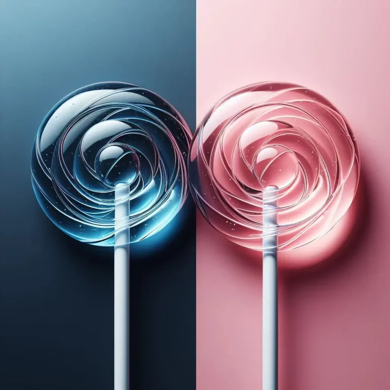
How many colors can be used in an online presentation?
Should you consider the colors present in the photos and videos you use in the presentation?
It’s quite obvious that making or finding photos and videos, the color scheme of which fully matches the three or four colors you’ve chosen for your presentation, is extremely difficult. But you don’t need to strive for this. It will be enough if you adhere to the general principles of restraint and minimalism. Especially if you order photos and videos or shoot them yourself.
How are different colors perceived from a psychological point of view?
It’s very difficult to give a definitive answer to this popular question. Too much depends on the culture of different peoples and the individual characteristics of each person. But, nevertheless, based on our experience and summarizing the opinions expressed in various sources, we dare to roughly describe the emotions and associations inherent in the most popular colors.
- White: Simplicity, purity, sincerity, medicine, air, day, winter.
- Black: Seriousness, elegance, masculinity, sadness, earth, night, unknown.
- Green: Growth, life, safety, nature, ecology, youth, spring, health.
- Red: Passion, strength, speed, determination, aggression, fire, sports, summer.
- Blue: Calmness, confidence, steady movement, water.
- Yellow: Light, warmth, sun, gold, bread, autumn.
- Orange: Optimism, happiness, energy, dynamics.
- Purple: Luxury, power, high position, creativity.
- Brown: Naturalness, strength, reliability, wood.
- Light blue: Sky, height, flight, lofty thoughts and feelings.
- Pink: Childhood, dreaminess, sunrise and sunset.
- Gray (metallic): Technology, industrialism, future orientation, high-tech.
What is the color temperature?
Traditionally, colors and shades are distributed into three large categories:
- Warm colors – spectrum from red and orange to pale yellow.
- Cold colors – spectrum from green to blue and purple.
- Neutral colors – black, white, and all shades of gray.
How to determine which color combination will be best for a specific online presentation?
The theme of the presentation, its audience, and the mood you want to convey are the foundation on which you need to build the color scheme of the presentation. Suppose you are set for a serious conversation with a mature audience. You can declare this using calm and neutral colors and shades. Your viewers are young people? You want to emphasize an informal style of communication? Then look for a solution in a bright palette.
It’s logical that in a presentation dedicated to cafes, restaurants, recreational boarding houses, and hotels, it’s better to use warm colors that create a sense of coziness. For promoting IT products, a combination of colder and “industrial” shades will be more suitable. A green color is called for in a presentation on the topic of ecology, and yellow in online content dedicated to baking.
You can list examples for a long time, but we’re sure you’ve caught the general meaning.
How to combine primary and secondary colors?
We recommend using the formula 60:30:10. You’ve chosen two primary contrasting colors. One of them should be the background. It takes up approximately 60% of all the visual space used. The second primary, used for main inscriptions and images, gets 30%. Additional (accent) colors are left with 10%.
Rules and tips - a guide for creativity
As a finale, allow us to give one more piece of advice. Always remember that templates, recommendations, and rules are nothing more than starting points for creativity. No set of tips, no matter how authoritative the source or “guru” giving them, will replace your unique approach and vision.
Good luck to everyone, successful presentations, and high incomes!